“I just paint the way I do because it’s so evident to paint that way.”
This simple statement provides a real insight into Mark Zug’s approach to painting and illustration. Everything is natural – although that does not mean easy.
“The most frustrating thing for me is to work through those times when I don’t feel like I have any ideas. I’m an illustrator, and I work on assignment, and they don’t wait around for you to have inspiration – there’s a timeline. If you’ve got an assignment that has to be done, and you just don’t have any ideas, bulling through those times can be the most frustrating part of being an illustrator. The way I do it is just to act as if I do have ideas, just draw and draw and draw and don’t worry if I’m making a lot of trash until eventually something catches.” Something does always eventually catch, and has ever since Mark started his career.
Over the last 10 years he has created countless illustrations for Magic: The Gathering, Dungeons & Dragons, Shadowrun, Dune, and an endless assortment of paperback publishers. He was awarded the Jack Gaughan Award for Best Emerging Artist in 2001, and won his first Chesley Award in 2005.
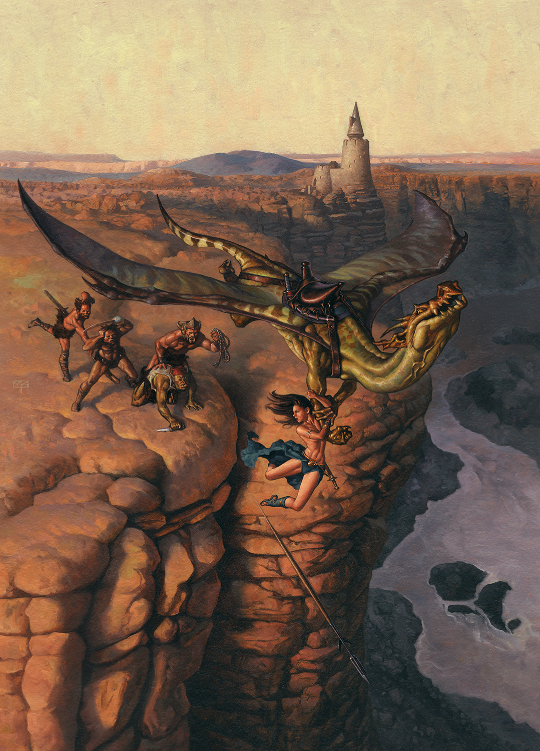
Considered by many to be an “artist’s artist,” Mark’s work flows from a deeply-rooted tradition exemplified by the Brandywine artists, with whom it was love at first sight when Mark discovered them as an art student.
“There was an illustrator named Ken Lager [a seventh generation Howard Pyle student] who lived in the area and came by the school to give a talk and a slide show about his favorite illustrators from the Brandywine school, all of whom I had been ignorant of. The only Brandywine artist I had known was Frazetta, and I hadn’t even known that he was Brandywine oriented. So I discovered all of these artists like Pyle and Wyeth and Parrish . . . . from that point forward I knew that it was a book illustrator that I wanted to be, and I reoriented all of my efforts towards building a portfolio.”
Like Mark’s interest in illustration, his love affair with oil painting blossomed immediately after their introduction. “I was a drawer for many years. When I was about 24, I decided to just grab some paint and start at it, working in acrylics. Since acrylics are a very quick drying medium, it meant that I was able to produce a great number of very poor quality paintings very quickly. I did that for a couple of months. Then, by chance, I happened to borrow an old set of oil paints from my mother. As soon as I started playing with them, I knew that oil paints were the thing, that this was how Frazetta and Wyeth and all of those people were making those marks. I knew it had to be oil paints for me from then on. It took me almost a year to feel comfortable with painting. Of course, that just meant that, after a year, I fancied myself a good painter – not that I actually was, just that I fancied myself to be one.”
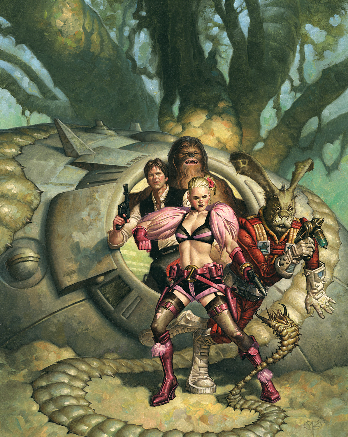
Given his background, the fact that he approaches his paintings from a classical perspective should come as no surprise. “My technical approach is the way oil painting has been done for hundreds of years, which is to start off with a drawing, and then upon that drawing apply very thin monochromatic oil paint with lots of solvent, and over that put some thicker oil paint. When that dries a bit, I then put the thickest oil paint in the very lightest areas last. Most of the Great Masters painted more or less that way, and most of the artists in the great American school of illustration painted that way.
“It really suits the physical qualities of oil paints very well. By building it up like that, you take a drawing, which is by its nature just lines and greys, and then you put a little bit of color on that – usually oranges, browns, yellows, some kind of earth colors. When you do that, it shifts it into color, and your eye begins to see colors – but you’re not smashed with color all at once. Because these low key colors are applied very thinly, they dry very quickly.
“Then, by the time your eye is used to the color and starting to search out colors, you’re ready to bring in more powerful tones, like blues and greens and magentas, and that’s when the thicker paints come in. It allows you to really work out the colors in the piece – I’m always feeling out the colors while working. Sometimes I’ll have a bunch of books around me with my favorite art to give me some feel for what palette I might want for a given painting, but it never turns out like I thought it would.”
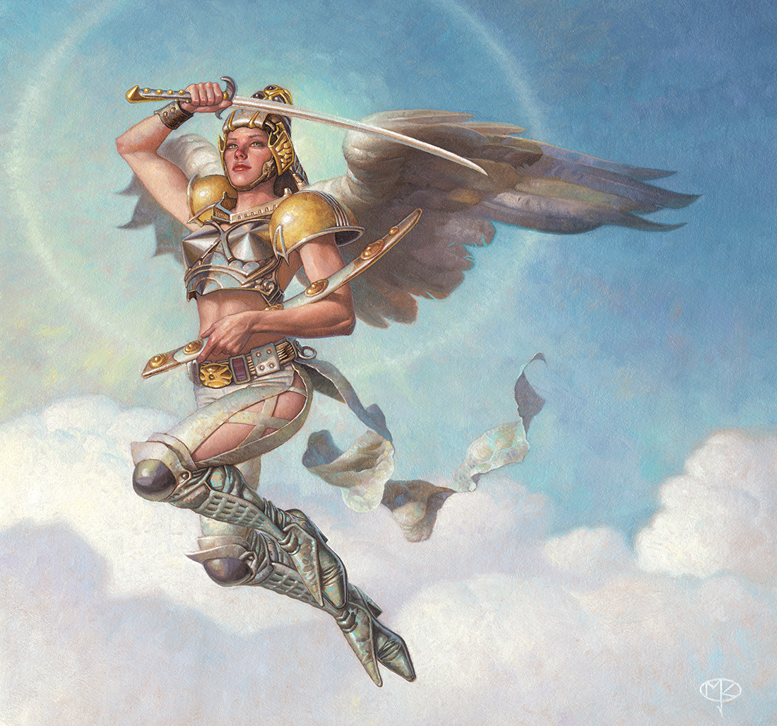
Mark’s work, and the color palettes he uses, have a very organic feel to them – his paintings appear to be grown as much as painted in many cases. It’s a very distinct stylistic hallmark – but not one Mark himself would recognize. “When I see a Zug, I know it’s mine because I remember having made it. I don’t know that it’s mine because it looks any different from any others . . . It’s kind of like wondering what people with American accents sound like to British people. If you’re American, you don’t know that you have an accent . . . I’m not aware of any accent that I have in painting, and that’s probably a good thing. If I had to try to include specific stylistic elements in every painting, I’d never finish anything. It would just be too long of a process . . . the subconscious works much faster than conscious inclusion.”
Although Mark remains mystified about his own stylistic look, he’s very clear on other topics – such as where illustration fits within the artistic continuum. “Illustration is in the position where classical music was in the time of what we call the classical composers, who were basically working professionals. Now, we think of Beethoven and Mozart as intellectuals plying their art, but the reality is that they were working on assignment, and many of them thought of themselves and each other as hacks.”
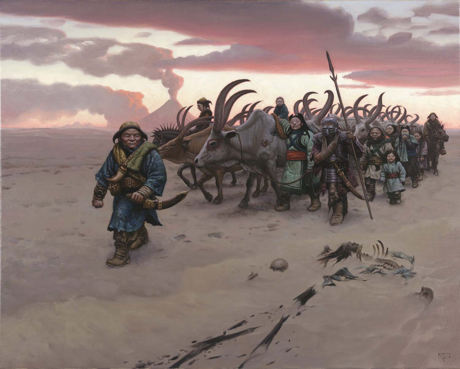
“I think the situation will remedy in time – I wish it was in my lifespan, but over time we’re going to see the people who produced the illustrations of today dissected and revered and put in museums because, at that point in the future, they won’t be practicing the same from in the same way and so they’ll look back with admiration and nostalgia at the things that artists do today.
“Honestly, this is something that artists have banged their heads against for the whole 20th century, and I would advise them to just stop banging their heads. N.C. Wyeth was tormented by the fact that the fine art world would not accept his work unless he started making ‘fine art’ paintings, and so he lost the enchantment with the world he painted so well and began painting landscapes and pastoral scenes. They were very nice, but you could tell that his vigor was when he was doing the pirates and the storybooks – that stuff was his favorite subject matter. But because the fine art critics had this elevated plane in his eyes, he felt that he had to adapt to their world. I would just say to my fellow illustrators, ‘Stop it!’ We don’t need to go into the fine art world as it currently exists – we just need to make our own. It’s not that hard.”
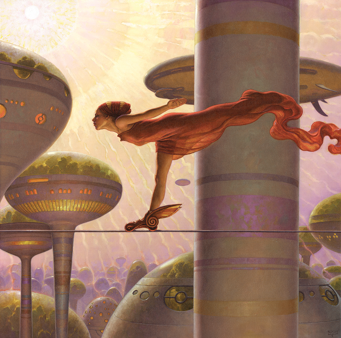
By the same token, Mark doesn’t buy the idea that illustration is somehow less “pure” because it involves art direction. “We do work in collaboration with art directors, and sometimes the coolest idea in a painting may, in fact, come from someone other than the artist. But while you’re told what to paint, but there’s no physical way to paint what you’re told. It’s not like they can dictate a painting to you. The number of options is infinite.”
Now, art directors digitally taking over a painting . . . . that’s a different story. “The digital revolution has really changed things. Photoshop is kind of like a lightsaber in the hands of a three-year old. It can give art departments the very false illusion that they can just give the vaguest possible art direction and then fix it all up when it comes in the door, which is just awful. It’s more frequent now that they will not really take the time to work with you, or to give you useful information, and then you’ll be surprised by something they’ve done to the work after you’ve handed it in.”
Mark doesn’t have the same feelings for digital art in general, though. “My attitude towards digital art is completely live-and-let-live. Digital can take a good artist to a great artist very quickly, but it can also just as quickly take an incompetent artist into the ditch. Justin Sweet is a good example. When you see his work, digital or traditional, you just feel like you’re seeing straight into his mind. It’s just the way he sees and the way he moves his hands. He is the perfect example of why I’m not concerned about their being a digital issue – it’s just another medium to me.”
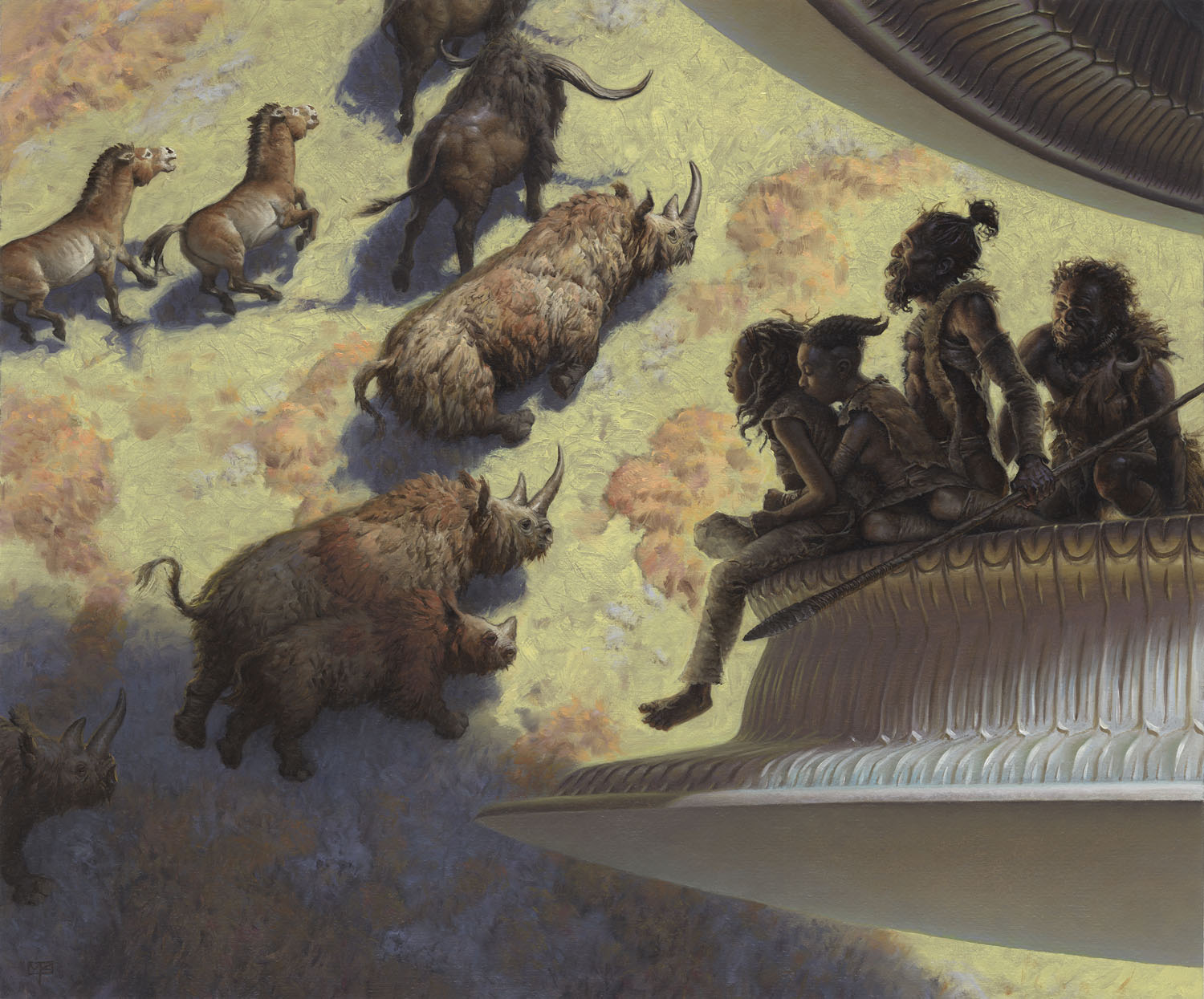
On the other hand, there is a downside to working with digital tools – there is no original work being created. Although extremely high-resolution large prints can be and are marketed from digital creations, Mark feels that there’s something missing.
“When you have a print, your are at a distance from the artist that guided that image into being. When you hang an original, the artist has nowhere to hide behind anything – he authorized every single scrap of light that you’re seeing. It contains a part of the artist’s brain – and not a reproducible part, because he could never think that exact same sequence of thoughts again.”
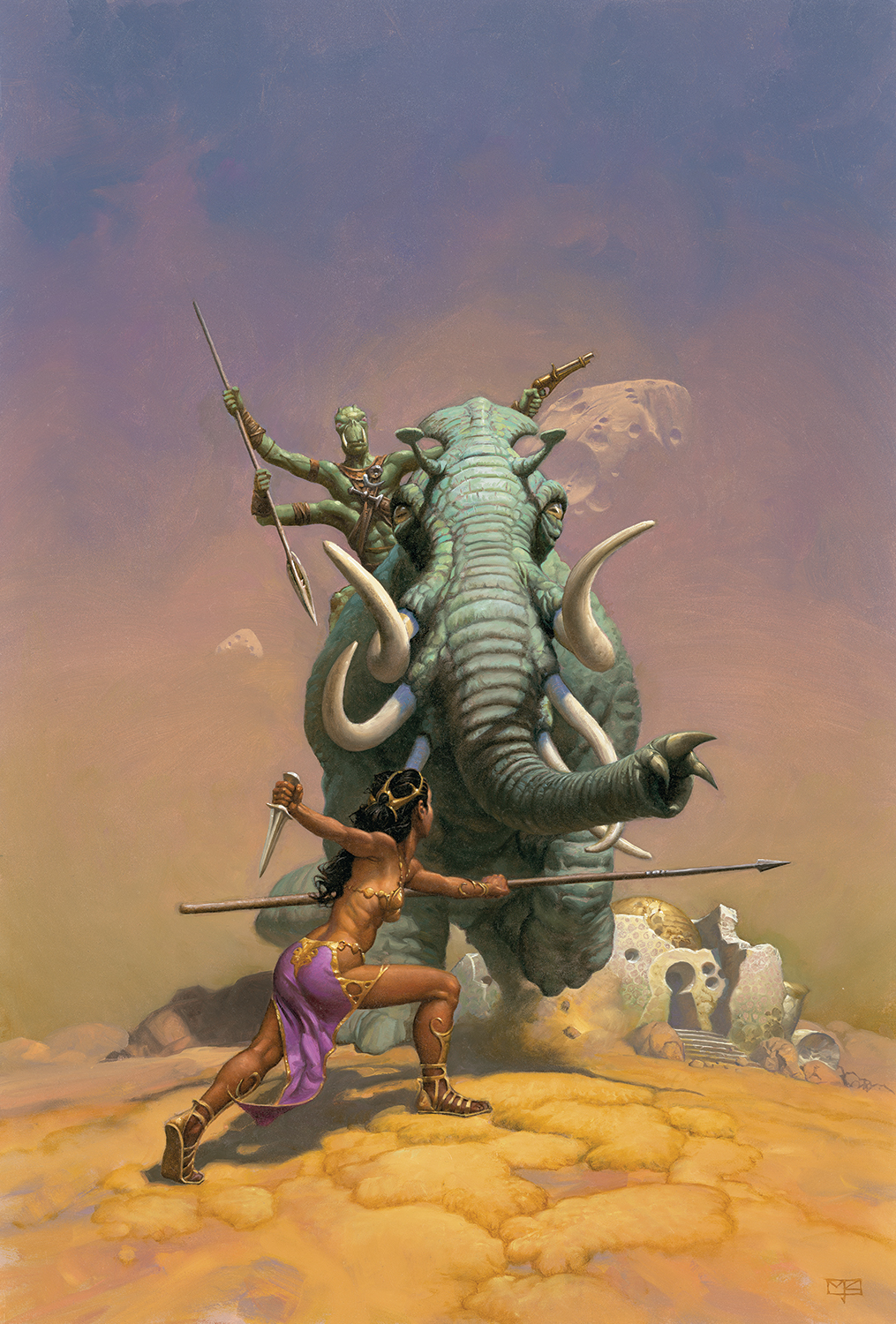
“I do 90% of my illustration traditionally. I’ve seen the buggy whip makers, and I don’t want to be among them. If I want to continue to make my buggy whips, then I need to make sure that they have something to recommend them other than my grousing that the automobile is here. I need to make sure that they are the most beautiful buggy whips around and that people will still want them.”
Based on the body of work that Mark has produced to date, and the level of craftsmanship, intuitive inspiration, and dedication that he puts into each and every painting, it seems that Zug’s Brandywine Buggy Whips will continue to be a thriving concern for many years to come.
“Of Brushes and Buggywhips”
By Patrick Wilshire
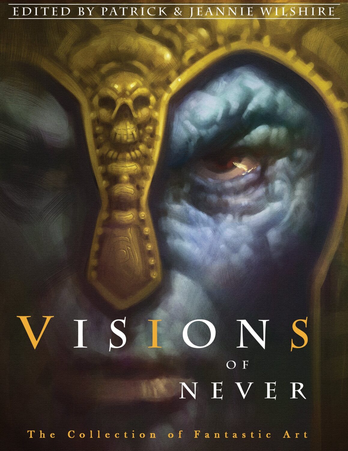
Originally published in Visions of Never (2009)